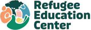
Refugee Education Center’s New Branding Reflects Diversity of Those we Serve
The Refugee Education Center’s updated branding reflects the diversity of those we serve and more accurately reflects the diversity of the program services we offer - all while paying homage to our past.
The Refugee Education Center’s team is so excited to share our new logo! The logo is made up of many elements that, when combined, reflect the wholeness of our mission - to be an education-centered child and family support agency. It reflects the diversity of those we serve and our program service offerings, which have expanded from our afterschool K-12 program to programs that serve children aged 0-5, K-12 students, and their parents! The logo also pays homage to our past, placing the Acacia tree of our old logo centrally in the new design. The last thing to notice is the modification and expansion of our brand colors, modernizing the color pallet and, again, recognizing the diversity in those we serve.
Read more below to learn about the individual icons and what they represent.
The CHILD represents the many children we have and will serve. We support children so that they achieve academic success at the rate of their American-born peers and support them in their journey to become fully participating members of the West Michigan community.
The PARENT AND CHILD represent our approach, which serves the entire family. We encourage and educate parents on how to be involved in supporting their child’s education, and we also work to support families at home as we know a child’s environment is key to academic success.
The HAND represents what holds us together, our shared humanity, and a visual representation of how, with our “hands connected,” we can hold each other up and make each other stronger. We are #BetterTogether!
Keeping the ACACIA TREE central in our logo pays homage to our past. Also, the Acacia tree is a shared cultural icon for some African cultures. Acacia trees are a place of respite (from the hot savanna sun) and, thus, a place for sharing, learning, reading, and gathering.
The BOOKS represent our commitment to being an education-centered support agency with literacy, English language acquisition, and academic success as top priorities.
A big thank you to our friends at Well Design Studio, who turned our vision into a reality!


